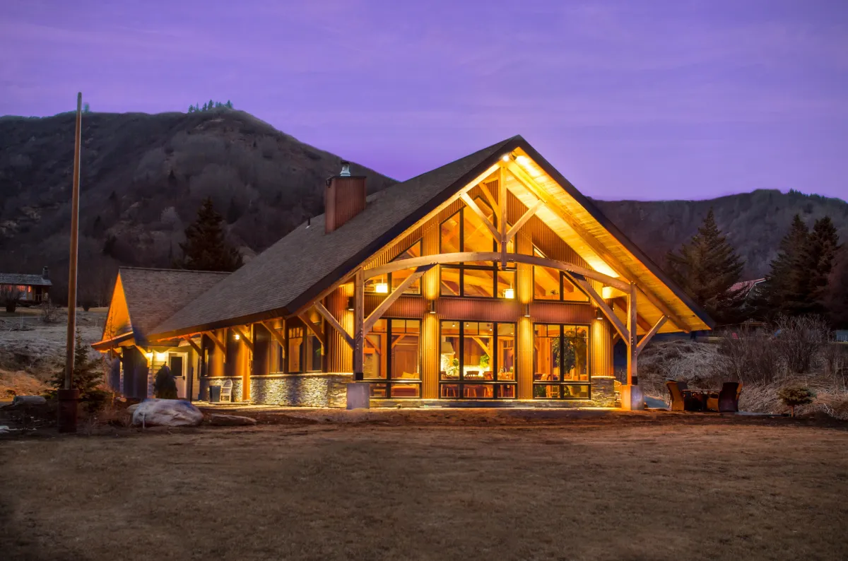
Alaska's Premier Real Estate Media
Launch Your Listings. Elevate Your Real Estate Brand.
Alaska’s Real Estate Media Partner for Realtors Who Want to Stand Out and Sell Fast.
Give Your Listings the 🚀 Launch They Deserve
Launch faster, stand out online, and attract more buyers with Alaska's most trusted real estate media experts.
We Don't Just Capture Homes
We Launch Listings!
Interior + Exterior Photos
Drone Photo + Video
Listing Websites
Cinematic Videos
Zillow 3D Tours
Done for you Marketing Templates
Social Media Videos
Floor Plans
Just Listed Postcards
More Than Just Photos — It’s a Full Marketing System
Everything you need to market your next listing like a pro — bundled into one powerful package.
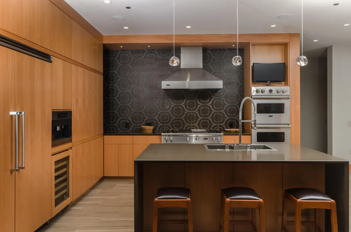
Professional Interior & Exterior Photos
Professional Property Photoshoots: Highlight property features with high-quality, professionally taken photographs that emphasize appealing spaces and selling points.
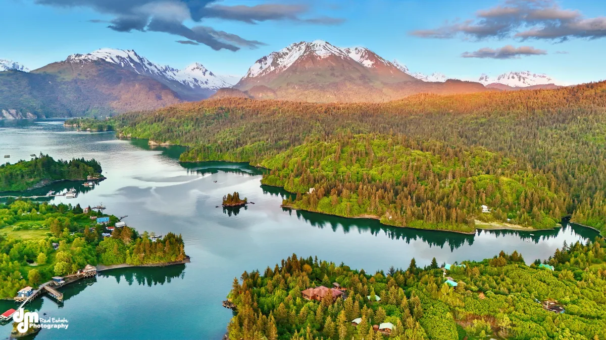
Drone Aerial Property Shots
Elevate property appeal with our drone photography, showcasing expansive views and the property’s layout from an engaging aerial perspective.
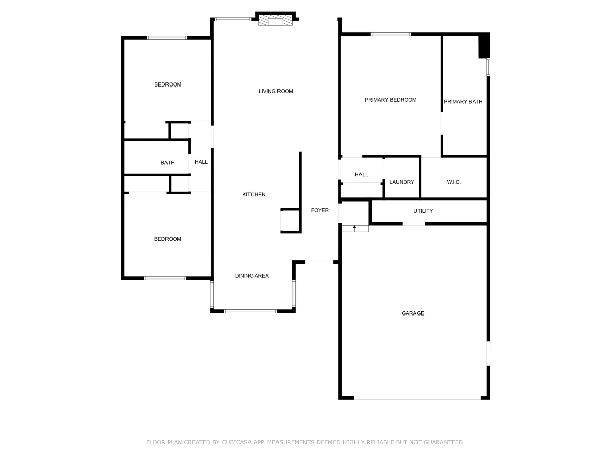
Floor Plans
Professionally designed floor plans help buyers visualize flow, scale, and space—making your listing feel more transparent and buyer-friendly. All our Photo Packages include Floor Plans
Dynamic Real Estate Videos
Elevate property marketing with our cinematic video tours, showcasing both interior and exterior features to engage buyers and speed up sales decisions.
From Prep to Postcards — We’ve Got You Covered
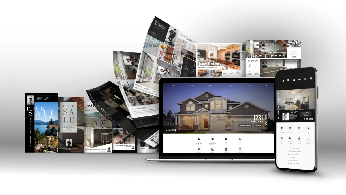
Social Media Marketing Kit
Pre-designed graphics, videos, and templates tailored for your listing. Easily share on Instagram, Facebook, LinkedIn, and more to generate buzz and position yourself as a marketing pro.
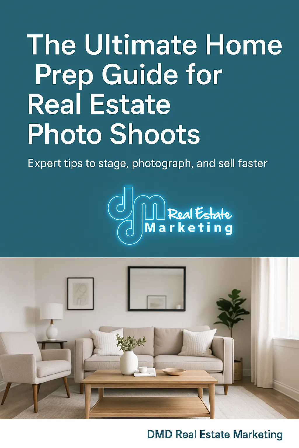
Home Prep Checklist and Guide
A simple, branded checklist you can hand to your clients to make sure the home is show-ready and photo-perfect—building trust and making you look like the expert.

5 Day Marketing Blitz
Daily step-by-step marketing ideas to launch your listing with energy. From social media strategies to email templates, this blitz ensures no eyeball is left untapped
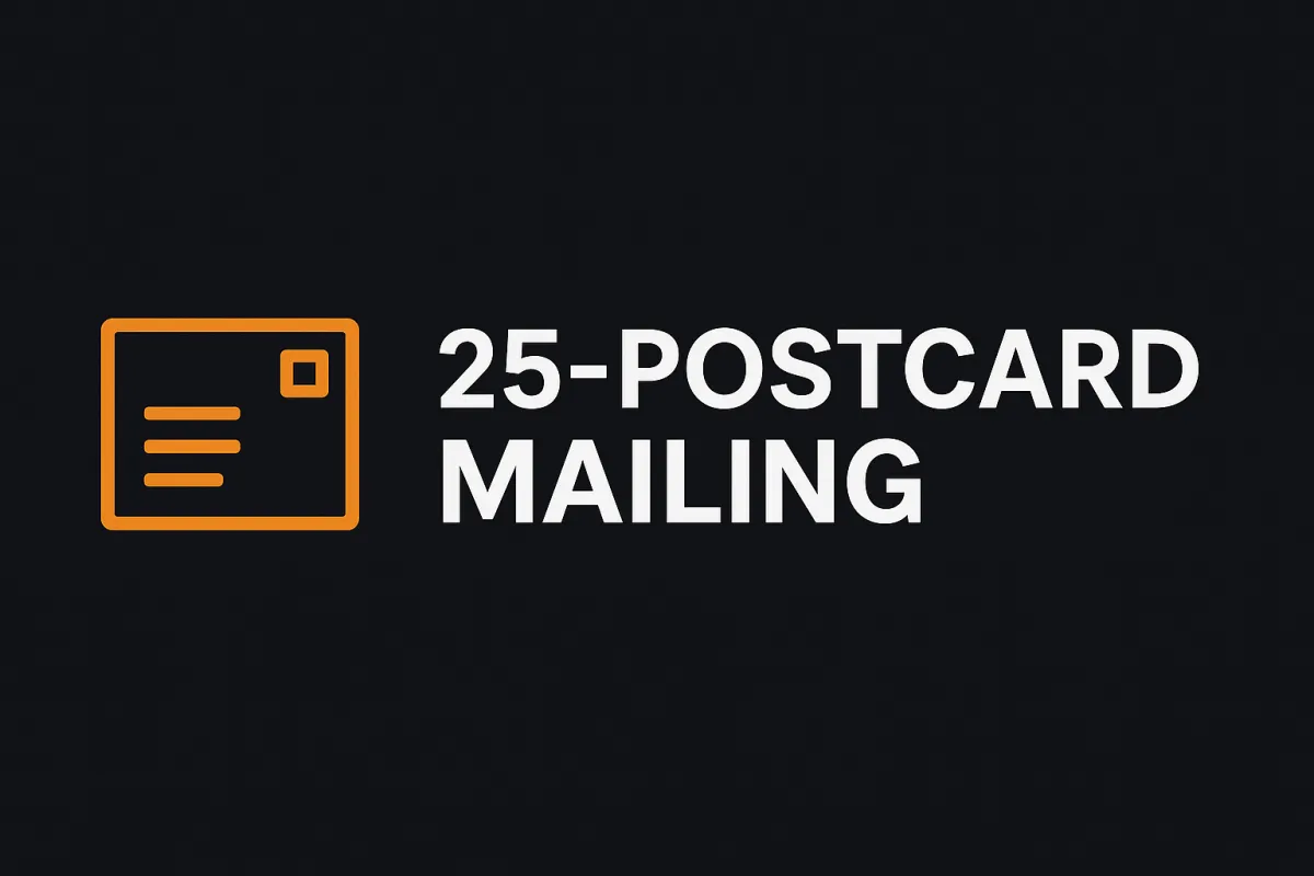
25 Postcards Delivered to the Neighbors
We’ll mail 25 professional postcards directly to neighbors, building buzz in the community and positioning you as the local go-to agent.
What Others Say About Us
FAQs
Your Questions Answered: Quick Insights for Confident Decisions
What sets DMD Real Estate Photography apart from others?
At DMD Real Estate Photography, we don’t just deliver photos — we deliver a complete marketing system designed to help you win more listings, impress your clients, and sell homes faster.
Here’s what makes us different:
Full-Service Marketing – Every shoot comes with more than just photos. We provide video, drone, floor plans, and even a ready-to-use social media kit to give your listings maximum exposure.
Agent-Focused Tools – From our Home Prep Checklist to our 5-Day Marketing Blitz, we give you resources that make you look like the marketing expert to your clients.
Consistency & Reliability – You can count on us for fast turnaround times and polished, professional media every time.
Local Expertise – We understand the New Mexico markets, the unique properties, and how to showcase them in ways that resonate with local buyers.
Partnership Approach – We don’t see ourselves as just a vendor. We’re your marketing partner, helping you grow your business and impress your sellers with every listing.
How long does a typical photo shoot take?
Shoots last between 1-3 hours, depending on the size and complexity of the property.
Are there any preparations needed before the photo shoot
Yes, properties should be cleaned, staged, and personal items removed to ensure the best presentation.
Can I choose which photos or videos are used for my listing
Absolutely. After the shoot, we will provide you with a gallery of images and clips to choose from. You can select which ones you would like to use in your marketing materials.
What areas do you serve?
We serve clients from Talkeetna all the way down to Homer
How soon after the shoot will I receive my photos and videos?
We typically deliver photos and videos the day after the shoot. Same day delivery can be arranged for an additional fee if faster turnaround is needed.

24 Hour Delivery
Photos Delivered Next Day

Satisfied Clients
Over 50 - 5 Star Reviews

Guarantee
Re-Shoot, Re-Edit, Refund
FOLLOW US
COMPANY
CUSTOMER CARE
Copyright 2026. DMD Real Estate Photography. All Rights Reserved.